The new infinityfree design looks amazing!!!
Idk… It looks a bit scattered around
1 Like
it looks terrible not gonna lie. it’s way harder to find things now
2 Likes
I almost have to agree with @VisualKitten and @NuvieNougat on this one. Although there seams to be a little more information, it looks too sharp and scattered in comparison to the fluid and rounded look of the old one.
Just my opinion here!
I like the new client area alot. It’s much more consistent with the forum and other parts of InfinityFree. But, in my opinion, it has a problem:

Everything just looks… disorganized. Like a bunch of boxes with information everywhere. There isn’t really a clear way to tell stuff apart.
also this isn’t as important but the InfinityFree logo at the top is kind of blurry, and the blue “free” kind of blends in with the darker background
Please take a look around before posting. We really don’t need multiple topics on this. (Yes, I know it has a bad name)
And in case you were wondering, I totally agree with you.
Hi,
There is already a topic about that subject although the title is not the best:
Personally, I like it.
I think that what you’re reporting could be easily solved by giving more emphasis to the section titles.
They may be somewhat less visible than they should be.
2 Likes
Didnt realize “Design!” meant client area
Yes, that’s true, they don’t really stand out, but I also feel like the boxes should be a little more… grouped
2 Likes
It was wasent the best name, so I can see how you overlooked it ![]()
Agree. I also liked the rounded corners and less sharp of colors on the old one. The banners and notifications are better though. (Though they also blend in, so they are less noticeable)
1 Like
Rounded corners are the new thing! I am ready for sharp corners to disappear!
I also like more muted colors!
2 Likes
I merged the topics now.
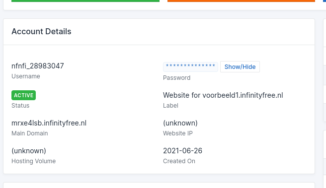
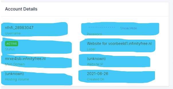
I get what you mean. The little cards are nice for displaying a few bits of information, but aren’t great when there are so many things to be shown. The tables worked quite well for that, but are a bit… bland.
That said, a lot of information is duplicate (the username and password are displayed three times), but experience has shown that presentation is important for making people understand what the details mean.
Do you have any other suggestions on how to do that page?
Agree. I think the amount of info should not change (If anything, add more), but I think you should round the corners (at least 5px) and maybe try a better grouping system like before.
I like the little cards/boxes, but I agree with @Greenreader9, there should be a more visual grouping system. my suggestion is to try to add the boxes in a larger box, but it may make it look even worse, I’m no expert at this.
What I think would be best is if the information was displayed in an accordion or tabs, so you don’t get all the duplicate info presented at once, but if you really need it, you can click on it to show all the information.
Kind of like ProFreeHost’s client area is what I mean, i guess.
Rounded corners are nice, but I don’t feel like it’s necessary for everything. Take a look at Windows 10, nothing’s rounded yet it still looks good. My biggest problem here is how some things are rounded (such as the “go premium” or the cards/boxes), and some things are not (such as the control panel buttons)
I like how there’s a change in the client area design every once in a while, as everything gets a bit bland after a while. But I do agree, the older client area was quite boring.
Also, this isn’t as important and is only my opinion, I feel like the InfinityFree logo at the top should be all white to pop out more, sort of like in the Knowledgebase or how the client area looked like a long time ago
1 Like
This is /account/account_id page
All of you can see that the current width is 483px

if width < 483, it showing like this

Solution: add
.table-responsiveclass in table’s parent class.card
After adding .table-responsive class in parents class .card

By the way This is /account page’s table is responsive

1 Like
I like that, maybe have it how you had it before, but have these mini boxes within the larger box instead of just text.
I think displaying it all is best (It makes it look better in my opinion), as than people won’t click and come here saying “I CANT FIND MY FTP PASSWORD! HELP!!!” when all they had to do was click on a menu.
I can contradict that by saying take a look at Windows 11, it looks even better. I do see what you mean though.
All or nothing, I agree.
Case in point: Windows 10
This is why we upgrade things: Windows 11
Agree!
…
Why am I comparing a webhosting client area to the most popular OS again?
2 Likes
I personally hate the UI of Windows 11. Lot’s of people agree, lots disagree. I tried it, it’s gross,in my opinion. I think I might prefer Windows 8 over it. I think I’m going to stick with Windows 10 for the next couple of years. This is off-topic so I’m going to stop now.
But, it’s important to know that not everyone is going to be pleased. Some people (such as you) might welcome changes, others might not (such as me.) There’s never really a time where everyone’s happy, and the same goes for InfinityFree account area.
I don’t know.
That’s quite true. But again, it’s also quite a bit obvious, the way ProFreeHost did it:

(not saying I generally actually do like the profreehost client area.
But you’re probably right about that.
I hope that these ideas by everyone could help influence the way InfinityFree looks and feels, although in the end it’s the administrator who makes the changes.
Maybe there should be options so that you could change the client area to whatever version you like?? I never actually tried it, but I really like the way the material client area looked.
1 Like
I’ll be forced to; my PC is too old. And not all the featured are good. I basically like the rounded corners and transparency. I think it is starting to look too much like chrome OS.
Yep, although it is amazing how fast conversations can get out of hand and move to new topics
Not a bad design, I was imagining it a different way when you said it though. I do like our old design better, but everyone’s different!
10/10 idea, can only imagine how hard it would be to do that though.
It indeed is and I never liked how all the app icons were in the center. i don’t like Chrome OS much either.
true!
Yep, the exact point I was making before.
We’ll have to wait and see what the administrator says…
1 Like
This. We had a design like ProFreeHost before, but changed it, because every day there were people who complained “why is ftp down!”
FTP isn’t down. You just need to use the right connection details. And you need to click “FTP Details” to see them. Don’t go around guessing what you think the details should be.
That page went through like ten iterations to figure out what worked. This worked. Now people only complain FTP doesn’t work when it actually doesn’t work.
That design was taken from us.
Supporting 3-4 different bootstrap versions on the same design? Yeah, not going to happen.
I just put this together:
I can’t say I like it.
2 Likes
Ick. That looks worse.
The main idea is good, just fill in the details with a semi-transparent rounded-corner box (Like my horrible design below).
Yeah, don’t use blue. Also, maybe put the description (Like “Hosting Volume” “Main Domain” ect.) on top of the information if that makes sense. (I am horrible at explaining things, and my artistic skills need work).
Does that look OK?
2 Likes