How could I develop a sidebar that stands on the right as on this page abccuriosity.altervista.org And see only on the desktop version to be put both here hard-questions.com and in the articles (example: https://hard-questions.com/articoli/reimpostare-password-social html)?
You again? ![]()
Hi, the good news is that your site uses bootstrap (v3)
To put something right in the vertical column
you need to use your bootstrap (grid options)
and define .row and .col in your html code
The sidebar itself is not difficult to make after that, and how it will look depending on your wishes.
Hardest thing is to generate content inside (unless you have the time and type the code manually)…
every time you create a new page content.
So it may be better to switch everything to WP (less hassle) and then simply use wordpress plugin or whatever for sidebar.
Which will then scan all your pages and generate desired content on the right.
There is probably some PHP sidebar generator if you don’t want to use WP
but it needs to be adjusted first to your website and its CSS selectors…
In any case, choose the easiest way to maintain your website !
Now it may seem easy to insert a few squares with some info,
but later when website grows, and especially since your site is not uniform (each of your pages contains some hack around) it will be harder for you to remember all that and adapt something new to the existing code.
![]() Sorry
Sorry
hahaha ![]()
here’s a little more help - Your site uses 1140 grid sys… (12 col)
if you look at the source here (click me) you’ll find the answer for how

also look with the browser inspector (F12) everything on the right (sidebars)
this is how it is on firefox:

then with (2)
you move your mouse around the webpage
I just now saw this
ok here is an example of how to hide it at a resolution lower than 992
put this in some CSS
@media only screen and (max-width: 992px) {
.well{display:none}
}
this is what I made as example for this site above which uses css selector .well
for these elements on the right (sidebars)
and you can put any CSS selector instead (class or ID) (. or #)
 @media only screen and (max-width: 992px) {
    .mySidebar{display:none}
    }
Hi
You didn’t give me the link but I found this online version so I tested on it
https://hard-questions.com/articoli/account-google-tutorial.html
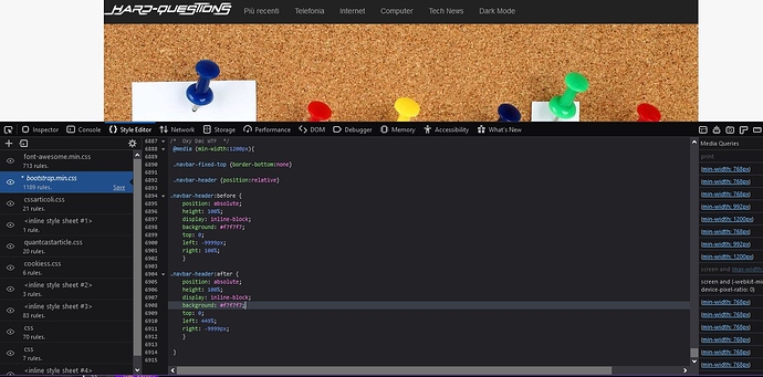
Put this (crazy hack around) code at the end of bootstrap.min.css
so it can override what is needed
/*  Oxy Dac WTF  */
 @media (min-width:1200px){

 .navbar-fixed-top {border-bottom:none}

 .navbar-header {position:relative}

.navbar-header:before {
    position: absolute;
    height: 100%;
    display: inline-block;
    background: #f7f7f7;
    top: 0;
    left: -9999px;
    right: 100%;
    }

.navbar-header:after {
    position: absolute;
    height: 100%;
    display: inline-block;
    background: #f7f7f7;
    top: 0;
    left: 449%;
    right: -9999px;
    }

 }
this is only for larger screens
because on the smaller ones everything would fall apart and look lodge as the elements in the content shrink and move depending on the horizontal size
and then it is better to have full width navbar instead of left and right ends (according to BODY background color)
P.S. as needed (depending on other pages) adjust the color to match the background
how can you test live ?
- click here
- open Firefox dev (F12)
- go to the style editor tab
- click the desired css file
- scroll to the bottom in his code
- press enter a couple of times to make room there
- and copy paste my code
- refresh = returns the state to the original
This topic was automatically closed 60 days after the last reply. New replies are no longer allowed.


